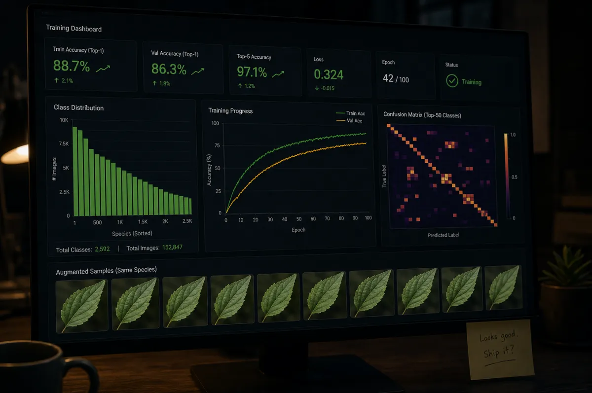
The class distribution chart finally looked right.
Not perfect. Still some variance between species. But the dominant classes weren’t towering over the rare ones any more. The ratio was sitting at about 4:1, down from 68:1. I could look at the bar chart without the sinking feeling in my stomach.
Loss was going down. Accuracy was going up. The pipeline didn’t crash.
I sat back and thought, that’s it, sorted.
Onto the next problem.
It wasn’t sorted.
The fix
The plan felt straightforward. The data was broken, so I fixed it.
Corrupt files, partial decodes, missing references. All gone. That was 28 files.
Then duplication. Perceptual hashing across the full dataset found 438 duplicates, about 24% of everything I’d collected. What had looked like scale was just the same images reused at different resolutions and compression levels. Keep the highest-quality copy of each. Delete the rest.
Then imbalance. Some species had dozens of images. Others had a handful. The model wasn’t learning plants. It was learning frequency. So I augmented the minority classes: flip, rotate, crop, distort. Generate 162 synthetic images across 17 under-represent species. Pull the ratio from 68:1 down to roughly 4:1.
Re-score everything. Run it again.
The chart looked right. The training runs held. I marked it resolved and moved on. It felt like progress.
The crack
The problems didn’t disappear. They just changed shape.
Scroll through a species in the augmented set and you’d see the same leaf seven times, each rotation a few more degrees off the last. Same texture, slightly distorted. Same background, slightly cropped. The variation was real in the strict technical sense. The pixel values were different. But anyone looking at the folder would tell you it was one photograph, repeated with minor variations.
The rare classes still behaved badly. I pulled out one of the species I’d boosted from a handful of images to forty through augmentation, and ran it through inference on a clean test image. The model predicted it correctly maybe one time in ten. The other nine times, it defaulted to one of the common species. The ones it had seen the most.
I checked another rare species. Same thing. Then another. The pattern held.
The dataset looked better. It didn’t feel better.
Something about it felt inflated. Like the dataset had got bigger without getting richer.
The realisation
I didn’t know what to do about that. The realisation didn’t arrive in one moment. It accumulated.
I’d been moving between the dashboard and the augmented folders for a couple of days, watching the metrics go up and the predictions stay wrong. Gradually over a period of a few days, the gap between the two stopped looking like a problem to fix and started looking like a problem I’d misunderstood.
I hadn’t fixed the data.
I’d reshaped it.
Cleaning removed noise. It didn’t add information. Deduplication removed redundancy. It didn’t create diversity. Augmentation created variation. But not the kind that exists in the real world.
A real-world dataset of a rare species doesn’t mean seven rotated copies of one photograph. It means that species photographed at the seedling stage, the vegetative stage, and the flowering stage. Photographed in full sun and in shade. Photographed in the north of its range and in the south. Photographed on a phone camera in 2019 and a different phone camera in 2024.
Photographed from above, from the side, and from below. The model needs to see the space the species actually occupies, not one point in that space rendered at slightly different angles.
I had made the dataset larger. I hadn’t made it more informative.
I’d been working from a simple idea: if the data is messy, clean it.
That wasn’t the problem. The problem was that the data wasn’t strong enough to begin with. Not enough real variation. Not enough coverage of how plants actually appear in the wild. Not enough signal for the model to learn from.
What I’d treated as a data quality problem was, underneath, a data sufficiency problem.
Those are not the same thing. And the fixes for one don’t fix the other.
A bigger model wouldn’t have helped here either. There wasn’t more to learn.
Running, not working
By this point, the system ran.
It didn’t crash. It produced outputs. The metrics said it was improving. The chart on the dashboard sloped the right way.
I still didn’t trust it. And I couldn’t explain why.
I thought the problem was still in the data. It was. Just not in the way I thought.
What I hadn’t yet realised was that some of the parts I was measuring weren’t doing what I thought they were doing. The pipeline I’d been measuring against was telling me something different from the pipeline that was actually running.
I wouldn’t find that out for another few months.
To be continued.